NutriFirst
● Type of project eCommerce for supplements
● Circumstances 2 weeks project at General Assembly
● My role Lead designer, Researcher
● Methodology Interviews, Contextual Inquiry
● Tools used Figma
● Deliverables Wireframes, Clickable Prototype
Background
In 2017, the sales value of the sports nutrition industry in Singapore reached 95 million Singapore dollars. This was forecasted to increase to 105.5 million Singapore dollars by 2022. This forecasted increase is attributed to the rising awareness of the importance of fitness and a balanced nutrient among the people of Singapore, which can optimise training and performance.
With the temporary closure of brick-and-mortar health and beauty specialist retailers during the Circuit Breaker lockdown, e-commerce is growing in popularity as a means of distributing sports nutrition products. Traditional offline retailers have ramped up their online capabilities to cater to e-commerce shoppers.


1. Research
The Problem
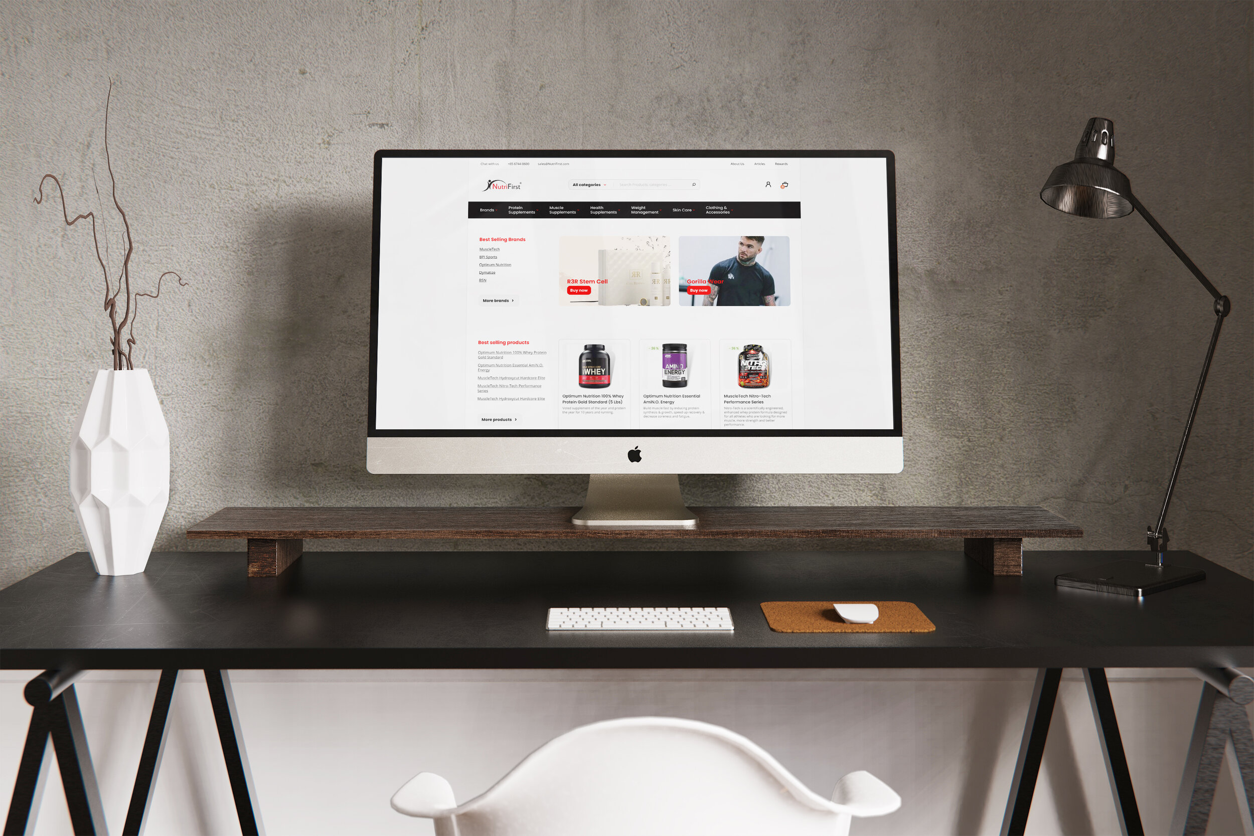
Users have difficulty navigating the current Nutrifirst’s website. Once they cannot locate the products they are looking for quickly, they will switch over to its competitors’ sites.
Understanding NutriFirst
NutriFirst is a company based in Singapore which specialises in sports nutrition & health supplement products. Their target demographic is fitness enthusiasts, who are familiar with their products. They do not cater to the mass market, hence some of the products will be unfamiliar to the general public.
Understanding the User
The target demographic is male with an average age of 40 years old. They are working professionals who gym recreationally. They buy sports and health supplements from online platforms.
User Interviews
I conducted user interviews on 5 users who buy supplements online with the following research objectives:
1. To understand the online shopping behaviour of the mentioned target group.
2. To find out users’ priorities and preferences in the purchase process.
3. To find out the pain points of users when using these websites.
Key Insights from User Interviews

1. Users are loyal to certain brands of sports supplements. They stick to the same brands based on the taste and efficacy; and rarely switch brands. They will buy the same brand from any online store, provided it is easy to search.
2. On the other hand, for health supplements, users buy them to maintain their general health or when they encounter a specific health issue. They are not brand loyal to health supplements. These supplements are meant for various functions, e.g. liver, cholesterol and joint. They buy them based on their function and the categories.

2. Synthesise

Persona
From the user interviews, the key insights were synthesised to form a Persona. The persona plays an important, if not fundamental role in UX design, as it helps me to create understanding and empathy with the end-users.
Click image to enlarge
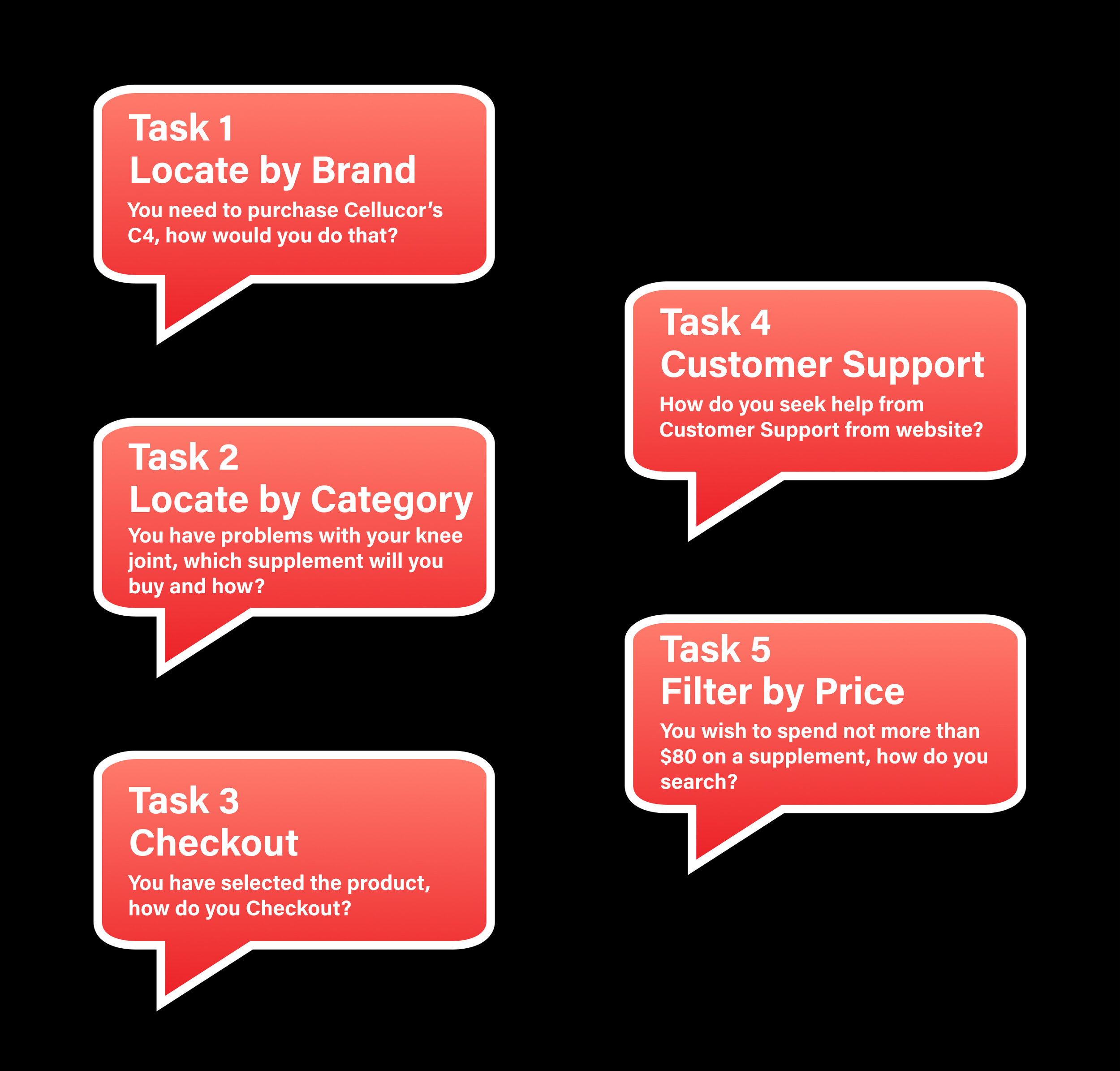
Usability Testing
In order to find out how well the current NutriFirst website works, I got 5 users to complete the following tasks.

SEQ Results
The Single Ease Question (SEQ) measures users' perception of usability based on the last attempted task.
*Rating: 1 - difficult / 7 - easy
From the Usability Testing Results, the 2 main problems were “Locate by Brands and “Locate by Category”. The users had no problems with the check out process. They could also locate the contact buttons via telephone or Facebook messenger easily. They could also filter by price relatively easily.
Hence the focus of the Redesign was on the 2 key issues - Brand and Category. The Filter by Price was added during the Refinement process of the prototype.

Affinity Mapping
From the Usability Testing, the feedback from the users were compiled and synthesised. The main key findings were:
Brand button is missing
The layout is messy, thus preventing users from finding their products
Click image to enlarge

Plus / Delta Analysis
This tool identifies what is going well and what needs to be changed.
Click image to enlarge
Key Insights
From the usability testing and affinity mapping, I deduced 2 major problems with the current website. They are congruent with the key insights from the user interviews which are as follow:

1. Buy by Brands
For a multi-brand online store, the “browse by Brand button” is critical as users buy based on brands and products they are familiar with. They do not go to the websites to browse. They are repeat customers who wish to top up their existing products. Once they cannot find the “Brands” button, they will exit the site and go to its competitors.

2. Buy by Category
The users buy products based on function, for instance for their liver heath. Hence the category button is critical as a search function. The existing menu is confusing and has wrongly categorised clothing accessories into category with edible products.
User Flows
For the current site, users need at least 4 clicks in order to locate an item by Brand or Category. According to Page Laubheimer, the 3-click rule is a persistent, unofficial heuristic that says that no page should take more than 3 clicks to access.
Click image to enlarge

Information Architecture
In order to establish the Information Architecture, I used Card sorting - a method used to help design or evaluate the site map.

Open Card Sort
The purpose of this study was to discover how users group and categorised items on the current website.
Open Card Sort with 30 participants, out of which 25 completed and results were analysed.
6 prominent categories & 1 sub category were fielded from the study.
This forms basic re-structuring of the Information Architecture of the new site.
Closed Card Sort
To affirm that the users of the new site can properly locate the items accurately and quickly, a second card sort was conducted.
This was a Closed Card Sort in which there were 3 different with 26 cards to be sorted.
The rate of success was 100%, affirming that the categories were named appropriately.
Click image to enlarge


Revamped Site Map
The results from the two rounds of card sorting enable me to form the Information Architecture of the new site.
Click on image to enlarge

3. Ideate
Sketches
Once the new sitemap was formed, I sketched the wireframe with the user’s priorities in mind. During the process, I constantly reviewed that the interface related to the user flows. This helped to narrow down the screens I thought would be most effective in conveying purpose of the website to its users.
Click image to enlarge

Wireframes
After the sketches, I created low fidelity wireframes to see if my sketched out ideas were feasible once digitised. They are used to create the global and secondary navigation to ensure the terminology and structure used for the site meets user expectations.
Click image to enlarge


4. Prototype
Validate
In order to find out if the newly established Information Architecture and site design work, I conducted a second round of Usability Testing with 5 new users.
New User Flows
For the revamped site, users can now locate by Brand and category with one click.
Click image to enlarge

Refine

Interaction State
During the refinement stage, I added Interaction states for the buttons. They turn red when the user scrolls over, enabling him to know which part of the site he is at and which category he is viewing.

Filters
From the user interviews, users’ secondary concern was to be able to filter the items according to their price. Hence, during the refinement stage, I added the “Filters” feature.

5. Takeaway
Challenges
Getting the right audience to do the user interview will provide accurate insights for the project.
Analysing and making sense of the results from the card sorting
Trying to use Figma as a design tool to do prototyping for the first time.
Next Steps
Due to time constraints, I was unable to refine the visual design to the desired level of satisfaction. I would like to incorporate more visual elements on the NutriFirst website that would reduce cognitive load so that users do not feel overwhelmed with the bulk of information. I would also like to identify more motivators for users to continue using NutriFirst website.
